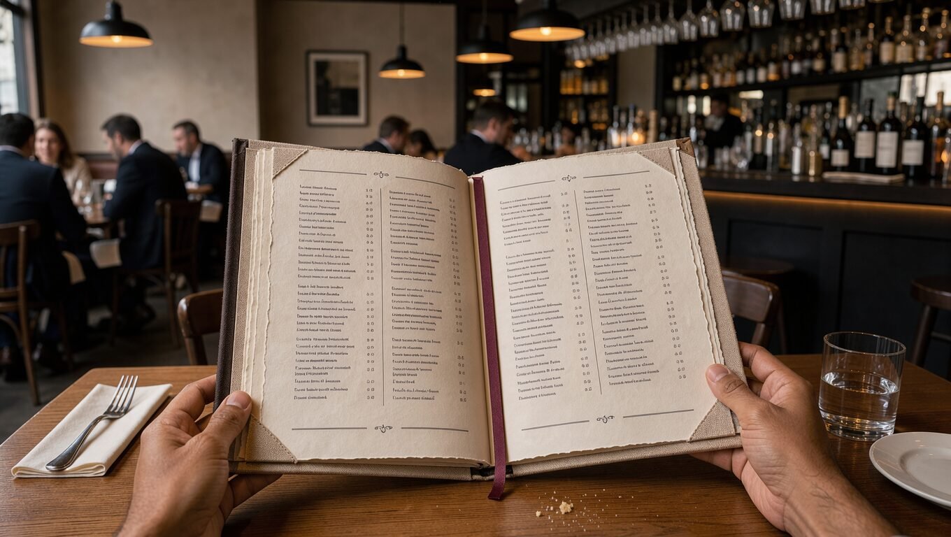
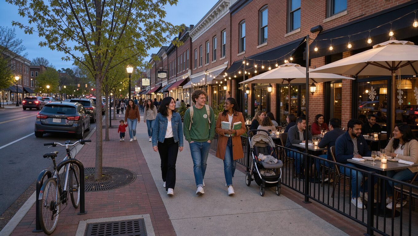
Evanston feeds a demanding crowd: Northwestern students and faculty, downtown professionals, families from the North Shore and visitors who read reviews before they book. Your menu is the one piece of marketing every single guest reads, and it quietly decides what they order and how they feel about the price.
Here is how we design and print menus for Evanston restaurants, cafes and bars so they sell better and hold up to service.
Menu layout psychology, briefly
- Guests scan, then read. Eyes land top-right on a single page and at the top of each section. Put your highest-margin dishes there.
- Boxes and subtle highlights draw attention to signatures — use them for two or three items, not ten.
- Short, specific descriptions sell: the farm, the technique, the one unexpected ingredient. Long paragraphs slow the table down.
- Seven items per section is a comfortable limit; more creates decision fatigue and slower turns.
- Photos work in casual and fast-casual formats; in fine dining they usually lower perceived value. Illustrations and texture do the job instead.
Presenting prices
Drop the dollar sign and the trailing “.00”; align prices after the description rather than in a column that invites comparison; avoid dotted leaders. Price a few anchor items at the top of the range so the rest feels reasonable. Keep the menu in sync with your delivery platforms so guests never see two different prices.
Materials that survive a Friday night
- Synthetic (tear- and water-proof) stock for high-volume casual service — wipeable, no lamination glare.
- Heavy uncoated cover stock in leather or linen folders for dining rooms that change menus seasonally.
- Laminated 14 pt for kids’ menus, patios and bars.
- Disposable single-sheet menus (printed in-house or in short runs) for daily specials and tasting menus.
- Table tents and inserts for drinks, desserts and events — the easiest way to raise average check.
Print and QR together, not instead
Post-2020, many Evanston restaurants went QR-only and then quietly brought print back: older guests, patios with glare and dead phone batteries all cost orders. The strong setup is a printed menu for the table plus a QR code to the same menu online for allergens, ordering and sharing. We design both from one source so they never drift apart.
Print specs and proofing
- Size to the holder: 8.5 × 11, 8.5 × 14 legal, 11 × 17 bi-fold, or 4 × 9 for drink lists.
- 0.125-inch bleed, CMYK, 300 dpi, embedded fonts, PDF/X-1a.
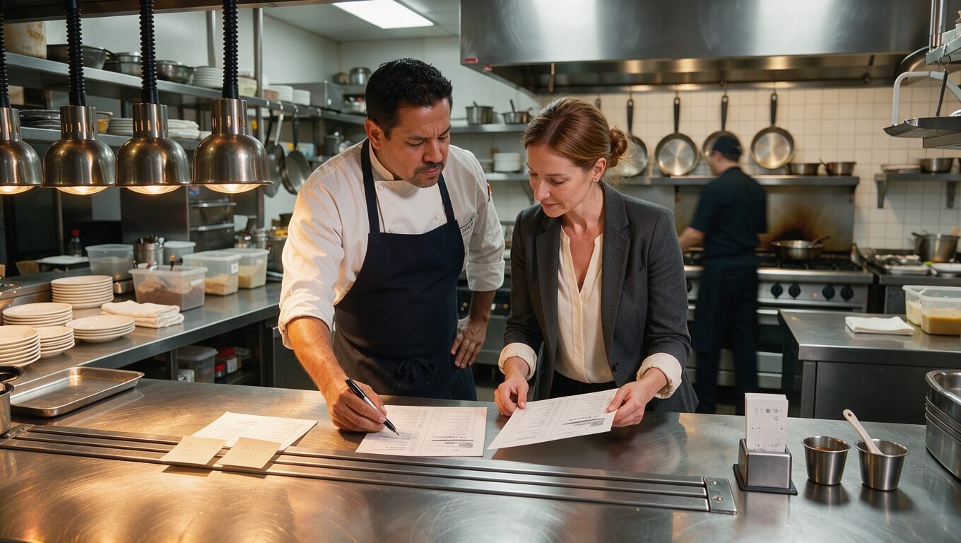
- A printed proof read by the chef and a server — they catch what designers miss.
- Build the file so prices and specials live on one layer for fast seasonal updates.
Keeping the brand consistent beyond the table
The same typography, colors and voice should run through the storefront sign, website, Google Business Profile, delivery listings and social posts. Our restaurant marketing team handles that whole picture, and our cafe marketing page covers the counter-service version. Start with a free marketing audit and we’ll include a quick menu review.
Frequently asked questions
How often should a restaurant reprint its menu?
Seasonally for most dining rooms (four times a year), with short-run inserts for specials in between. Reprint immediately if prices change — handwritten corrections cost trust.
Should my menu have photos?
Casual and fast-casual concepts benefit from a few strong photos; fine dining usually sells better with clean typography and texture.
Can you handle both the printed menu and the online menu?
Yes — one design system feeds the print file, the QR web menu and your delivery-platform listings so they always match.