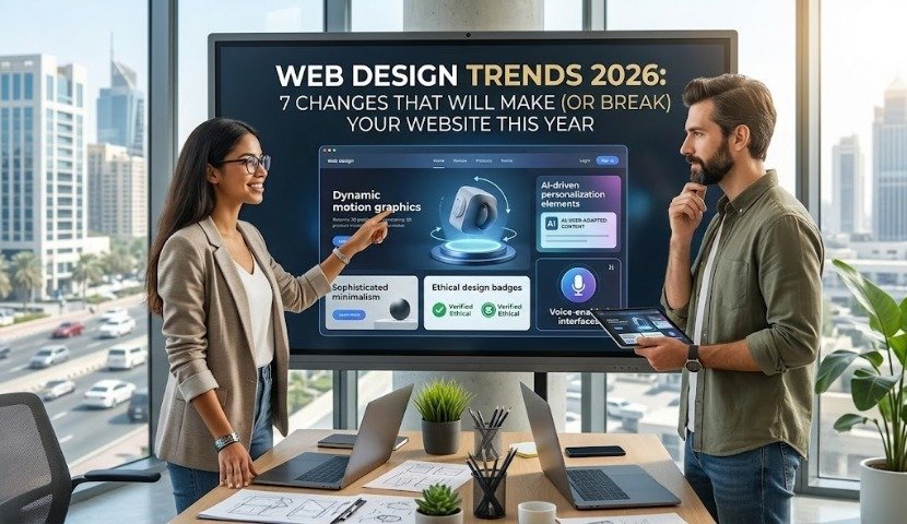
If your website still looks like it did in 2023, it’s not just “a little dated” — it’s actively costing you customers. 2026 is shaping up to be a year where the gap between businesses that update their web presence and those that don’t will be more visible than ever. Between AI-driven personalization, a swing back toward bold and tactile design, and Google rewarding sites that are fast and genuinely useful, the bar for “good enough” has moved.
Here’s what’s actually changing in web design this year — and what’s realistic for a small or mid-sized business to adopt without blowing the budget.
1. Bold, Tactile Design Is Replacing Soft, Floaty UI
The rounded-corner, drop-shadow, everything-is-floating aesthetic that dominated the early 2020s is fading. In its place: high-contrast color blocks, thick borders, oversized type, and interfaces that feel intentionally “engineered” rather than decorative. Agencies are calling it neo-brutalism — raw and confident, but still usable and accessible, unlike the rough brutalism of years past.
What this means for you: You don’t need to overhaul your whole brand. A homepage hero section with bold typography and strong color contrast can modernize a site without touching your logo or color palette.
2. Typography Is Doing the Heavy Lifting
Big photography used to carry a homepage. In 2026, text itself is the visual centerpiece. Thanks to variable fonts, headlines can shift weight and width as a visitor scrolls, and single words can stretch across the entire screen. This isn’t just style — it also means less reliance on huge image files, which helps page speed.
What this means for you: A strong, well-set headline is now doing double duty as both your message and your visual hook.
3. Bento Grids for Scannable Content
Instead of long scrolling sections, more sites are organizing information into clean, modular blocks — like a bento box. It’s an easy way to present services, pricing, or portfolio work so visitors can scan and find what they need in seconds. The catch: these grids need careful mobile planning, since a layout that looks sharp on desktop can turn into a jumbled mess on a phone if it isn’t built correctly.
4. AI-Personalized Pages
Websites are starting to quietly adjust themselves based on who’s visiting — a returning customer might see relevant product recommendations, while a first-time visitor gets a clear explainer instead. Done well, this lowers bounce rate and increases the time people spend on a page, both of which help SEO. Done badly, it just feels chaotic. The trend here is subtlety, not gimmicks.
5. Dark Mode and Accessible Color Choices
Dark mode has gone from “nice to have” to expected, especially for tech, creative, and content-heavy sites. At the same time, designers are pulling back from overly saturated “dopamine colors” in favor of calmer palettes with one or two energetic accent tones — better for accessibility and less fatiguing for visitors who spend real time on your site.
6. Performance and “Machine Experience” Matter More Than Ever
AI search crawlers and traditional search engines both reward lightweight, fast-loading sites. Heavy JavaScript and bloated image libraries are being replaced with lean CSS-driven design. A beautiful site that takes six seconds to load is now a liability, not an asset — both for human visitors and for how AI tools evaluate and cite your business.
7. Motion With a Purpose
Micro-interactions — a button that confirms a click, a form field that guides you through an error — are now expected on professional sites. The difference from a few years ago is intent: animation in 2026 is about reducing confusion, not just looking impressive. A subtle fade-in on scroll beats a flashy animated intro almost every time for business websites.
The Bottom Line
You don’t need to chase every trend on this list. The businesses that win in 2026 are picking one or two shifts that fit their brand and executing them well — a bolder homepage, a faster site, a cleaner mobile layout — rather than trying to do everything at once.
If your site is due for a refresh, Chicago Tech Solutions can help you figure out which of these trends are actually worth the investment for your business, and build a site that looks current and loads fast.
FAQs
Do I need to redesign my entire website to keep up with 2026 trends? No. Most businesses benefit more from targeted updates — a modernized homepage, improved page speed, better mobile layout — than a full rebuild. A web development partner can audit your site and tell you what actually moves the needle.
Is dark mode necessary for every website? Not necessarily. It’s most valuable for content-heavy sites, dashboards, and tech/creative brands where visitors spend longer sessions. A simple brochure-style business site may not need it.
Will these design trends hurt my SEO if I don’t adopt them? The trends themselves won’t hurt your SEO, but the underlying performance improvements behind them — faster load times, cleaner code, mobile-friendly layouts — directly affect search rankings. That part isn’t optional.
How often should a business update its website design? As a general rule, plan for a meaningful visual refresh every 2–3 years, with smaller updates (speed, content, mobile fixes) ongoing throughout.
What’s the most important trend for a small business to prioritize? Performance and mobile usability. Bold design and animation are nice-to-haves; a fast, clean, easy-to-navigate site on any device is the foundation everything else sits on.
Applying These 2026 Web Design Trends Without Breaking What Works
Website design trends are worth following selectively. The ones that matter in 2026 are the ones tied to how people and machines now consume a page — not the visual fashions that will look dated by next spring.
The three 2026 web design trends worth acting on
Speed as a design constraint. Design decisions are performance decisions. Full-screen video headers, heavy animation libraries, and eight custom font weights all cost load time, and load time costs conversions on mobile far more than most owners realize.
Designing for AI readers. A growing share of visitors arrive having already read a summary of your page inside an AI assistant. Pages built with clear headings, direct answers near the top, and proper structured data get summarized accurately. Pages built as a series of image-heavy hero panels get skipped.
Accessibility as default. Contrast ratios, keyboard navigation, and real alt text are increasingly a legal expectation as well as an ethical one — and every accessibility improvement is also a usability improvement for older customers, who are often the ones with money to spend.
What we would not chase
Elaborate scroll-jacking, cursor effects, and experimental navigation patterns test badly with the over-45 audience most local businesses depend on. If a visitor has to learn how your website works, the design has failed regardless of how it looks in a portfolio.
Website redesign questions
How often should we redesign? Structurally, every four to six years. Incrementally, continuously — a site that gets small improvements monthly rarely needs a dramatic rebuild.
Will a redesign hurt our rankings? It can, badly, if URLs change without redirects or content is trimmed. Done with a proper migration plan, rankings hold and usually improve as speed and structure get better.
What does a redesign cost? For a small business site in Chicagoland, typically a few thousand dollars, with the range driven by page count and how much content needs writing rather than by the design itself.
See our web development and UI/UX design services, or get a free assessment of what your current site is costing you.